Kicking Off the Anniversary Year with a New Logo
Preserving Tradition, Evolving the Brand
GUNOLD’s distinctive brand identity is getting a fresh new look. In anticipation of its 100th anniversary next year, the long-established company from Stockstadt is already unveiling its redesigned logos. The focus is on a contemporary look and greater independence for individual brands.
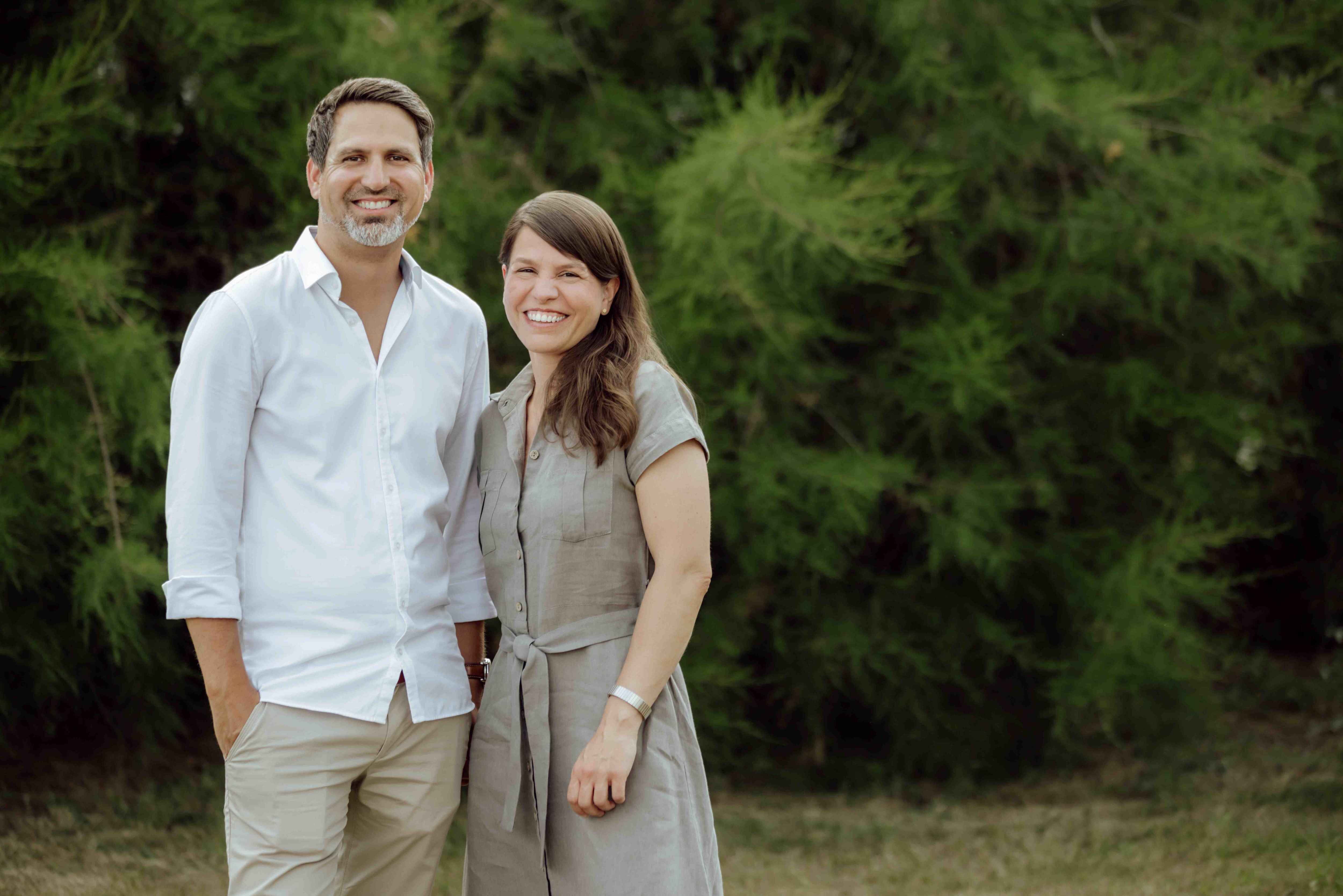
Founded in 1927 by Paul Gunold in Plauen, the family-owned business has been led since 2024 by siblings Aileen and Kevin Gunold—the fourth generation—at the company’s current headquarters in Stockstadt am Main. A look back: In the 1920s, the development of the so-called “Würker” machine initiated the development of multi-head embroidery. Company founder Paul Gunold recognized the potential of this technology and opened a studio to produce designs and punch cards for controlling the new embroidery machines. Over the decades, these humble beginnings evolved into the internationally active GUNOLD GmbH, now a specialist in embroidery materials with a comprehensive range of products and services.
“What has never changed in our 100 years as a family-owned business is our enthusiasm for embroidery and our passion for high-quality products,” says Marketing Director Stephan Gunold. The company has always been committed to offering practical solutions that provide real added value for customers. “This is firmly anchored in our GUNOLD DNA and will continue to shape us in the future.”
GUNOLD took the upcoming company anniversary as an opportunity to redesign its brand identity. The new logos are a visible result of this effort. Stephan Gunold: “We were convinced that it was time to further develop our brand identity and give it a new, contemporary look.”
New Logos – Clear Brand Profiles


With the new logos, GUNOLD GmbH now makes a clearer distinction between the corporate identity and the individual brands. This makes it easier for customers to navigate the brand landscape while simultaneously sharpening the brand profiles. The corporate logo now pays homage to the company’s roots and has been updated to include the year GUNOLD GmbH was founded. The brand logos for the “GUNOLD” professional division and the “SULKY” hobby division have been given a slightly modified, fresh look.
In the case of SULKY, the “by Gunold” tagline has also been removed. “With SULKY, we offer our products in smaller make-ups and, above all, for creative people who are passionate about embroidery, sewing, and quilting,” explains Stephan Gunold. Through SULKY, GUNOLD has also been active in the hobby and creative market since 1985 Now is the
time to more strongly reflect SULKY’s independence in its brand identity as well.
With its new logos, GUNOLD is visibly positioning itself for the future: with high quality standards, comprehensive service, and the goal of offering its customers the best possible solutions. Behind this are people who bring their passion for embroidery and their expertise to work every day. “Our new logos are more than just a change in appearance. They are an expression of our corporate identity—one that has evolved over nearly 100 years while remaining forward-looking,” emphasizes Stephan Gunold.
For more information, visit: https://gunold.de
Images: Photos: GUNOLD